|
|
Post by Gooman on May 14, 2011 7:51:33 GMT -6
Is there going to be any more definition in Bisharp's claws? I just see a big silver morass. If you could add in some thin lines to give the claws an outline, your Bisharp would be perfect (at least in my opinion)- everything else looks great.
|
|
mechy
Moderate Trainer
  *chomp*
Posts: 348
|
Post by mechy on May 14, 2011 11:53:53 GMT -6
I like it. I don't see anything wrong with your Bisharp. By the way, wouldn't it be easier to just finish the whole picture and then upload it? Or do you like being a tease? Ya know, now that I think about it, I am being a bit of a tease aren't I? Tis partly a habit from another forum where I hate to leave a thread dry for too long, and partly to see if anyone sees any problem I missed. Is there going to be any more definition in Bisharp's claws? I just see a big silver morass. If you could add in some thin lines to give the claws an outline, your Bisharp would be perfect (at least in my opinion)- everything else looks great. Aye, I do. I probably should have waited until I shaded it to post a WIP since the way I'm working on this pic the definition is almost non-existant without it. ^_^; And thanks guys, that puts my mind at ease a bit. It's been bugging the entire time I've worked on it. >_< Next time I post this pic in here should be the finished one, since I think what I've got left is simpler and less annoying than the previous two (well bisharp anyway). |
|
|
|
Post by quilteej on May 14, 2011 16:56:16 GMT -6
At first the Bisharp looked really wierd, because I didn't realize those were its claws, but now it looks pretty awesome.
|
|
mechy
Moderate Trainer
  *chomp*
Posts: 348
|
Post by mechy on May 21, 2011 12:29:08 GMT -6
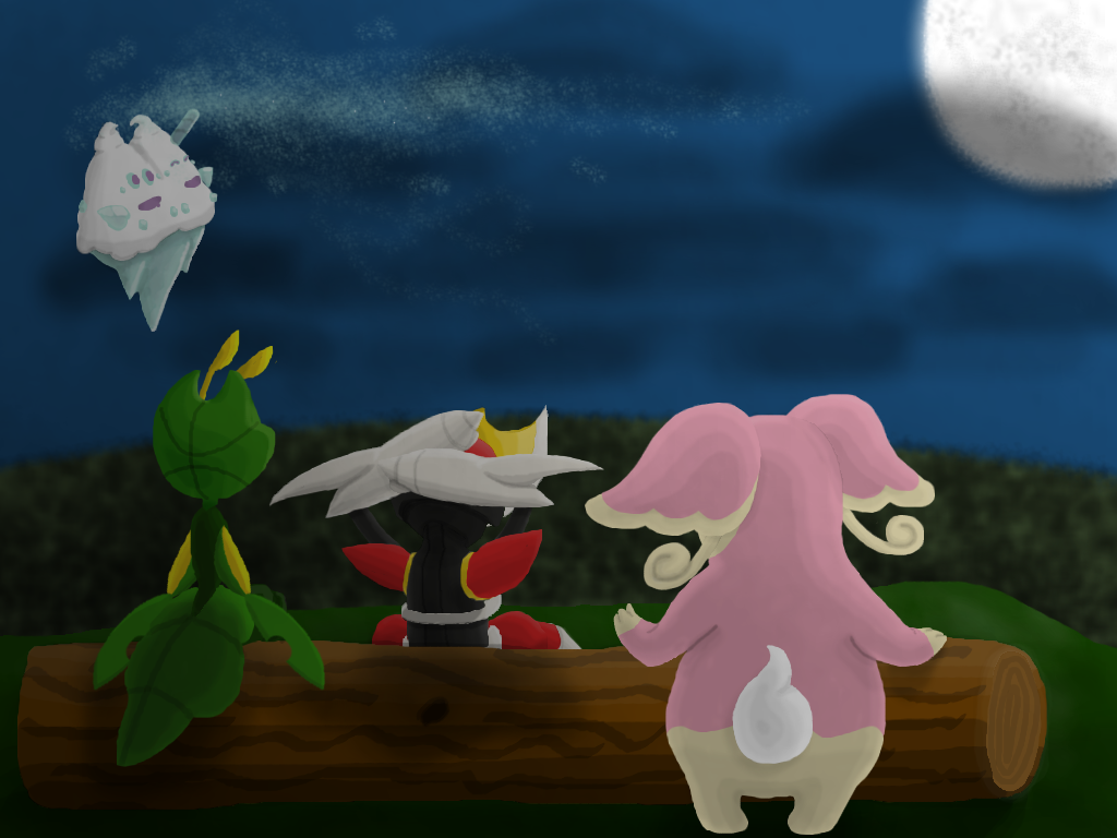
Took me longer than I thought, but I finished the rest of it.  Was originally supposed to just be my three main pokemon from Black, but after Bisharp I noticed something and instead went with putting all the female pokemon I used in my party. Figure I'll make one of the males later to go with it or something. So these be Vivanelle the Vinalluxe, Chimi the Leavanny, Vicki the Bisharp, and Zimi the Audino... and no, I only just now noticed the minor naming theme to my slight chagrin. Not quite satisfied, I'm half tempted to go back in and try to tweak it some more; but I'll just let it sit for now. As you can probably tell, I more or less phoned it in by the time I got to finishing up the rest of the background. Now to fool around before figuring something else to make.... |
|
|
|
Post by quilteej on May 21, 2011 15:39:33 GMT -6
It looks great
|
|
|
|
Post by SeriousJupiter on May 21, 2011 16:20:39 GMT -6
Beautiful. Absolutely beautiful. I especially like Vivanelle's icy breath, even though I deeply dislike the Vanillite line.
|
|
|
|
Post by Gooman on May 21, 2011 17:28:03 GMT -6
Amazing. One of the best pieces of Pokemon artwork I've seen.
|
|
mechy
Moderate Trainer
  *chomp*
Posts: 348
|
Post by mechy on May 25, 2011 19:46:13 GMT -6
Heh, thanks ya'll, I really appreciate it.
Kinda in a funky mood of late, so I can't really think of anything to make right now... at least not anything that won't take an annoying amount of effort to get references for.
As good a time as any then to take a request or two I suppose.
Can be anything really, just fair warning that I'm not spectacular when it comes to humans and tend to take my time (if my previous picture wasn't enough of a hint XD).
|
|
|
|
Post by Gooman on May 25, 2011 21:11:26 GMT -6
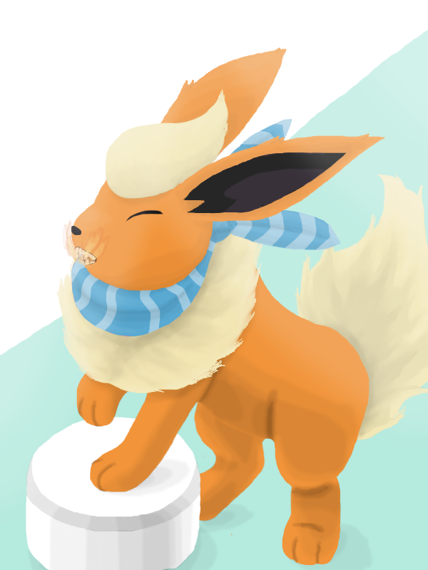
I'd like to see a Flareon looking fab-o with a choice scarf while using Fire Fang, either in a battle or on a runway. You can pick. (And if it's a battle, you could just use a random number generator to find an opponent if you want.)
|
|
|
|
Post by SeriousJupiter on May 26, 2011 5:27:19 GMT -6
You're taking requests too? This must be my lucky day!
I request a battle between Serperior and Samurott. I want Serperior to use Leaf Storm and Samurott to block the attack with Razor Shell (in the anime, pokémon block each others attacks all the time). I don't want the picture to show a clear winner, so neither pokémon should look like it has the upper hand. The background can be pretty much anything you want, it doesn't matter to me.
Please do this and I'll try to finish your request about Emboar and Leavanny soon. Okay, thanks.
|
|
mechy
Moderate Trainer
  *chomp*
Posts: 348
|
Post by mechy on Jun 2, 2011 2:12:16 GMT -6
 Here be your request Austin Ponies, sorry it took so long and hope ya like it. Would normally say more, but it's way past midnight here and need some sleep. @_@ |
|
|
|
Post by SeriousJupiter on Jun 2, 2011 8:23:05 GMT -6
Fire Fang doesn't look very fiery to me, but otherwise the picture is very nice.
|
|
mechy
Moderate Trainer
  *chomp*
Posts: 348
|
Post by mechy on Jun 2, 2011 13:35:27 GMT -6
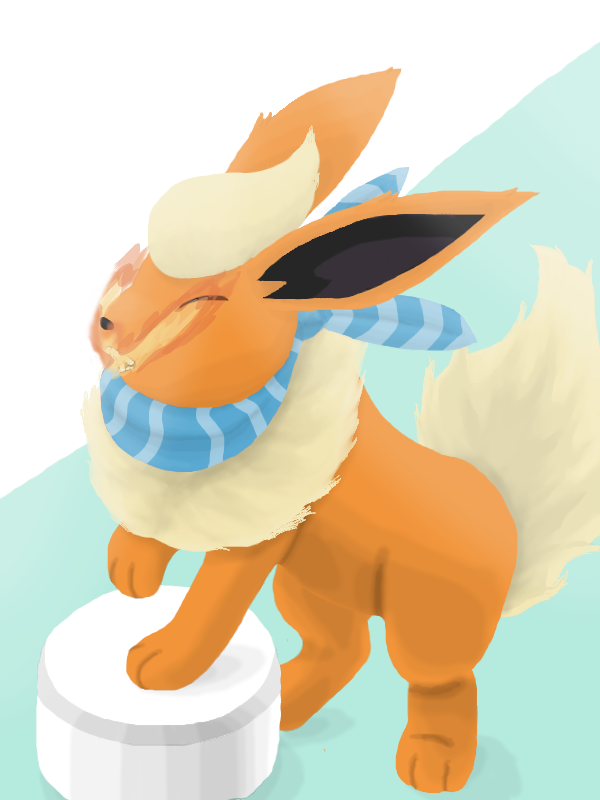
Yeah, trying to portray that threw me for a loop. Didn't help that it was the last thing I did, since by then I'd worked and reworked many of the things (including redoing the scarf due an idiot oversight I made from the start), so my patience was thin. But aye... the fire fang is crappy. >_< After having gotten some sleep I tried my hand at the fire fang again to see if I could fix it up a bit. At this point I'm just gonna back off and leave it be, otherwise I'll drive myself nuts trying to get it right.  |
|
|
|
Post by Gooman on Jun 2, 2011 14:08:03 GMT -6
I think I see Kanto's next top model!
I love your artwork.
|
|
|
|
Post by SeriousJupiter on Jun 2, 2011 14:33:13 GMT -6
That's much better!
I can't wait to see my request.
|
|